Understanding Soundings/Skewt’s/Aerological Diagrams.
Part A.
I will break this SkewT/ Soundings down into a few parts.
You may have all seen a sounding or heard of storm chasers/enthusiasts, pilots, meteorologists and others talking about soundings, SkewT’s or Agrological diagrams at one point in time or another. So what is a sounding and how do you read or understand what is on a sounding?
They may at first appear overwhelming but hopefully in this thread we can break them down so that everyone can understand the wealth of information on them as easily as possible.
In some ways it reminds me of the Matrix movies, Tank and the other operators are looking at what appears to be just green binary numbers on a screen, but as Tank and others said, they see a lady in a Red Dress, an agent, a glitch or Neo doing his thing. It becomes a picture to them. It is like watching the radar, one day I posted “I would love to be out under that cloud to get a photo of it”. Someone replied back and said it is not clouds but moisture that is showing up on the radar. That is 100% correct, but over the years of watching, chasing and observing, I don’t see rain anymore, I see what sort of cloud that the imagery is showing in the sweep, that moisture is now a cloud in my mind’s eye. I may see a rotating shelf cloud, a horizontal roll cloud, a gust front, an embedded storm cell, or a messy non photogenic thundery storm etc. I still see the rain but I also see what the cloud would most likely look like.
The same with Soundings, instead of lines and numbers, a quick glance will sort of give you an idea of what is happening. Is there going to be rain, snow, a dry storm, severe storm, a possible tornadic event, or it will be hard for a storm to fire off today. There is so much information on that one sounding. The sounding takes a slice of the atmosphere and gives us readings of the vertical or horizontal distribution of temperature, humidity, pressure, wind, and other physical parameters of the atmosphere.
A sounding is produced by the data collected from the weather balloons that are released at many locations around Australia.
Figure1 below is the sites in which the balloons are commonly released.

The balloon is usually filled with hydrogen due to lower cost, though Helium can also be used. The unit that performs the actual measurements and radio transmissions hangs at the lower end of the string at the bottom of the balloon, and is called a radiosonde. We used to have 2 soundings a day, but due to cost cutting, there now is only the morning sounding available to read at approximately 11:00am. If there is a significant weather event or possible storms, then BoM will release two balloons at some of the locations that could or are affected, one in the morning then one later in the afternoon.
That is one of the disadvantages of the soundings as they are limited to certain areas that they are released in, that being approximately 200 KM’s. So for example the sounding released in Brisbane does not cover what is happening in the atmosphere in Stanthorpe. To try and compensate you can triangulate between Moree, Brisbane and Charleville and compare the soundings to see the differences. Or if you have experience you can adjust the forecast sounding with current observations. Another disadvantage and that goes for all areas, is the atmosphere changes every split second. It constantly changes.
So what does a sounding look like?
Figure 2 is the sounding from the famous The Gap Storm in Brisbane on the 16th of November 2008

So now let us break down all those lines with just a blank chart

Now we will add some letters to help describe each of those lines.

Some of the things I post can be found can be found at
https://www.meted.ucar.edu/index.phpI have a done few courses through them and they are fantastic. It is free but if you wish to donate to them by all means do.
I have made this section as simple as possible because it really is the technical side of the SkewT and you can get lost easily. So if you are not sure ask question or google for a more in depth technical description of each of those lines that make up the SkewT /Sounding.
The first one is
A. Isobars

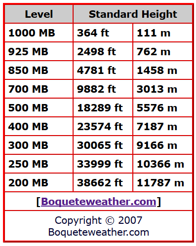
Isobars. These are the lines of equal pressure that run horizontally from left to right and are labeled on the left side of the diagram. Pressure is given in increments of 100 mb and ranges from 1000 mb to 100 mb. Spacing between the isobars increases in the vertical because of the log scale that is used to represent pressure.
The Chart below can be used to help and understand what height corresponds to the MB’s
B/ Dry Adiabats

Dry Adiabats are slightly curved, solid lines that slant from lower right to upper left. They are labeled every 10 degrees Celsius and indicate the rate of change of temperature in an air parcel of dry air rising or descending adiabatically.
C/ Moist Adiabats

Saturation Adiabats are the slightly curved, solid lines sloping from lower right to upper left. They are labeled every 2 degrees Celsius and indicate the rate of change of temperature in a saturated air parcel as it rises pseudo-adiabatically. They become parallel to the dry Adiabats at the top of the chart because of the very low moisture content at those levels and stop at 200 mb.
D/ Isotherms

Credit: UCAR Comet Program Skew-T module
Isotherms are lines of constant temperature. They are the namesake of the Skew-T chart because they are skewed 45 degrees to the right. Skewing the Ts may seem a little unintuitive, but a Skew-T allows us to easily calculate important atmospheric levels and parameters like the Lifting Condensation Level (LCL), Level of Free Convection (LFC), the Equilibrium Level, and CAPE. A Stüve is like a Skew-T but without the skewed temperature lines. It is not as useful for most meteorological applications because the adiabats on it are not curved, meaning we can’t accurately calculate the things listed above.
E/ Saturation Mixing Ratio Lines

Saturation Mixing Ratio Lines. These are the dashed and very slightly curved lines that slope from the lower left to the upper right that represent lines of equal mixing ratio. They are labeled on the bottom of the diagram in grams per kilogram of water vapor. They extend only to 200 mb and the spacing between them decreases as their values increase.
The next part, we will look at are the Barbs, wind direction and the sounding itself.
Cheers
Colin.
hopefully it all came across from word, I had upload all the pics again so hopefully everything is in order. I will do a reproof read but I have to run and get some things done. Took a bit longer than I thought.